There’s something quietly powerful about walking into a space that feels calm the moment you step through the door. No bold clashing colors, no overwhelming patterns — just a warm, breathable palette that wraps around you like a worn-in cashmere sweater. That’s exactly the feeling that soft neutral apartment decor delivers, and it’s trending for a very good reason.
Whether you’re starting fresh in a new apartment or giving your current space a thoughtful refresh, designing with soft neutrals isn’t about playing it safe. It’s about creating a home that feels timeless, layered, and deeply personal.
What Are Soft Neutrals — And Why Do They Work So Well?
Soft neutrals aren’t just white and beige. They’re a full family of understated tones — warm creams, dusty taupes, soft greiges, blush whites, sandy tans, and muted clay shades. What they share is a low saturation that keeps them visually quiet without feeling cold or sterile.
The reason this palette works so brilliantly in apartments is range. Small spaces can easily feel heavy or chaotic with bold color. Soft neutrals do the opposite — they stretch visual space, bounce natural light around, and create a sense of cohesion that makes a compact apartment feel intentional rather than cramped.
They also serve as the perfect backdrop for everything else: your furniture, your art, your textiles. The neutrals recede and let those elements shine.

Starting With the Walls: Choosing the Right Neutral Base
The biggest mistake people make with neutral walls is going too white. Stark, cool whites can feel clinical and flat under artificial lighting. Instead, reach for whites with warm undertones — think linen white, antique cream, or soft alabaster.
A few shades worth exploring:
- Warm White — Creamy, slightly yellow-toned. Ideal for living rooms and bedrooms.
- Greige — The perfect blend of gray and beige. Works beautifully in open-concept layouts.
- Dusty Taupe — A deeper neutral with brown and pink undertones. Great for accent walls or bedrooms.
- Soft Clay — An earthy, muted rust-adjacent tone that adds depth without going bold.
Test your chosen shade in different lighting conditions throughout the day before committing. What looks like a soft warm beige in morning light can shift noticeably by evening under warm bulbs.
Furniture Choices That Anchor the Neutral Palette
Go for Texture Over Color
In a neutral room, texture becomes your main design tool. Without it, the space risks looking flat or forgettable. Layer different material finishes to create visual depth:
- Linen sofas with a relaxed, slightly rumpled silhouette
- Wooden furniture — raw oak, walnut, or light ash for warmth
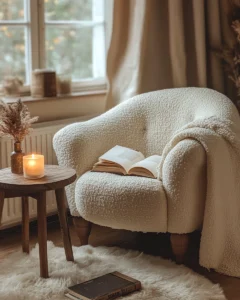
- Rattan or woven accent chairs that introduce an organic tactile quality
- Velvet cushions in muted dusty rose, sage, or deep taupe
The goal is for the eye to have things to land on — subtle contrasts in sheen, grain, and weave that make the room feel rich without adding a single drop of color.
Shape Matters
Beyond material, pay attention to furniture silhouette. Curved pieces — a round coffee table, an arched mirror, a boucle armchair with a soft scoop seat — feel naturally softer and more welcoming than sharp-edged, angular furniture. In a neutral palette, these curves reinforce the gentle, unhurried atmosphere.
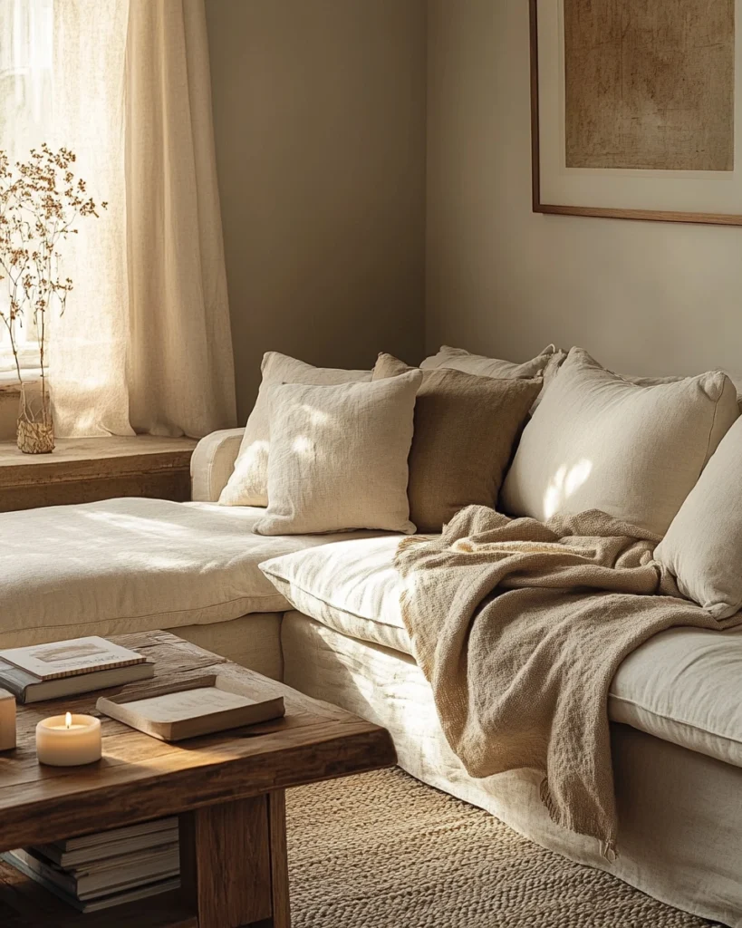
Textiles: The Secret Weapon of Soft Neutral Interiors
If your walls and furniture are the bones of the room, textiles are the soul. In a neutral apartment, the right layering of fabric elevates everything.
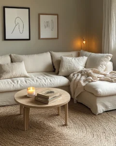
In the living room, layer your sofa with at minimum two different throw pillow textures — perhaps a chunky knit and a smooth linen — along with a larger throw blanket. Vary the neutral tones slightly: an ivory pillow next to a warm sand one next to a dusty taupe cushion creates depth without breaking the palette.
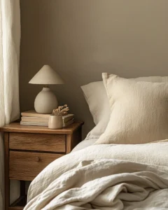
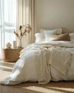
In the bedroom, invest in quality bedding. A linen duvet cover in natural white or soft oat, layered with a waffle-knit blanket and mismatched pillow arrangements, creates that casual, lived-in luxury that feels expensive without trying too hard.
On the floor, a large jute, wool, or low-pile rug anchors the space. In an apartment, the rug defines zones — especially in open layouts — so don’t go too small. A rug that extends well under the front legs of the sofa always reads as more intentional.
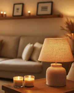
Lighting: The Element That Makes or Breaks a Neutral Palette
Soft neutrals are only as beautiful as the light they’re seen in. Harsh, cool-toned overhead lighting can strip all the warmth out of a carefully curated neutral room in seconds.
The fix is layered lighting:
- Ambient light — Overhead fixtures on dimmers, ideally warm-toned (2700K–3000K bulbs)
- Task lighting — Table and floor lamps placed strategically around the room for reading and accent
- Accent lighting — Candles, LED strips behind shelving, or small plug-in sconces for atmosphere
Lamp shades matter more than most people realize. A linen or cotton drum shade diffuses light beautifully and casts a warm, honey-toned glow that makes neutrals look their absolute best.
Artwork and Accents: Personality Within a Neutral Framework
Neutrals don’t mean boring, and your art and accent choices are where your personality lives. The key is curation — a few meaningful pieces rather than surfaces cluttered with decorative objects.
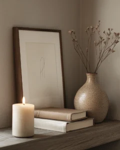
For art, line drawings, abstract ink works, and sepia or monochrome photography all complement a soft neutral palette without competing with it. Warm wood frames or simple thin black frames look clean and considered.
For accents, focus on:
- Ceramics in irregular shapes — small bowls, vases, sculptural objects in matte clay finishes
- Candles in amber, vanilla, or unscented cream tones for visual warmth
- Books stacked on coffee tables and shelves — both decorative and personal
- Woven or macramé wall hangings to introduce handmade texture
Resist the urge to fill every surface. Negative space in a neutral room isn’t emptiness — it’s intentional breathing room that makes the curated pieces feel more significant.
Pulling It All Together: The Soft Neutral Apartment Formula
Creating a cohesive soft neutral apartment comes down to a simple principle: vary the tone, unify the temperature. Every piece in the room — walls, furniture, textiles, accents — should sit within the same warm or cool family. Mixing a warm cream sofa with cool gray-toned walls creates tension. But a warm cream sofa with warm taupe walls and warm oak floors? That’s harmony.
Use this quick checklist when styling each room:
- ✅ Walls in a warm-toned neutral (cream, greige, taupe)
- ✅ Furniture in complementary neutrals with varied textures
- ✅ At least three textile layers (throw, cushions, rug)
- ✅ Warm-toned lighting (lamps + dimmers)
- ✅ Art and accents in natural materials or muted tones
- ✅ Breathing room — don’t overcrowd surfaces
Final Thoughts
A soft neutral apartment isn’t a design compromise — it’s a design choice with real confidence behind it. When executed with intention, it creates one of the most livable, emotionally comfortable spaces imaginable. A place that doesn’t demand attention but earns it slowly, with every well-chosen detail.
Start with your walls, build your furniture around texture and silhouette, layer your textiles generously, and let warm light do the heavy lifting. The result will be a home that feels like exhaling — and that’s exactly what a dream apartment should feel like.
